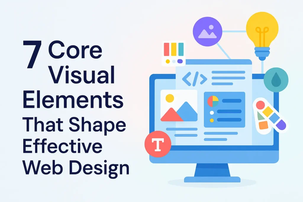
Your site is your initial contact with a potential customer and therefore should be something greater than a digital brochure. It should be a welcoming, reasonable, and beautiful-looking storefront. But how does one create a genuinely remarkable site? Not luck or a popular theme; it’s the brilliant combination of seven simple visual elements. To any entrepreneur, building a beautiful web presence is at the heart of building a beautiful and strong web presence that creates meaningful results. Let us delve further into the most important ingredients that make up the web design today and how they can make your business rock on the web.
1. Why Lines and Shapes Matter: The Geometry of User Experience
It begins with fundamentals. Lines and shapes are building blocks that constitute your site’s foundation. Lines direct an eye and divide content into a seen hierarchy. We’re leaving the strict, rigid grids as of 2025 behind. Designers are opting for asymmetry and “visible grids” that provide another injection of dynamic energy.
Shapes, however, determine your content areas and help set the mood for your whole site. As challenging as geometric forms such as rectangles and squares are, contemporary design more and more challenges them with softer and more curvaceous shapes. This “Organic Matter” movement, as we have come to know it, is a response to embracing a necessity to marry technology and nature to develop designs that are intelligent and a bit more human.
2. How Do You Utilize Space and Layout to Your Benefit?
Space, or white space, is where you place everything else; it’s not evil. It’s an effective design tool that will provide your content a little room to breathe. The 2025 trend is “bare-bones brutalism” and “bold minimalism,” which is the intentional use of space to create effective, not complex, designs. Without spacing, your site will be muddled and discombobulated.
A good design structure gives space to maneuver with, giving an essence of attention visually and balance. Give the objects lots of space for them to be far apart, and you get attention and concentration. The majority of the world’s high-end luxury brands currently employ a single hero image and minimal text atop a humongous background, something that hollers confidence and greatness. But yet another hot trend, the “Bento Grid” (tip of the hat to Japanese bento boxes), puts content into a structured grid-based design that is as pretty as it is extremely scannable, yet another user interface design must-have trend.

3. What’s the Secret of a Great Color Palette?
Because it is most deeply linked to emotion and psychology, your color palette is the most psychological and emotional visual element. A carefully planned color scheme can create an impression, remind people of your company, and make people remember your website. Speaking in 2025, we observe the trend towards “dopamine color schemes,” which are strong, striking, and even conflicting colors used to build an aura of awe and thrill.
- Bold and Saturated: Plain colors are passé; bold colors and gradients are being utilized by designers to create a lasting impression.
- Retro-Futurism: Merging 80s and 90s retro color palettes with contemporary design to create a magic aura.
A color palette that everyone would love is best for a professional and well-designed website. Even then, the trend now is to utilize color in a creative and whimsical way to emphasize your brand message.
4. Why Typography Is So Special. Dynamic and Expressive Type
Typography is the craft of setting type so that print on paper is legible and beautiful. Your typography speaks volumes about the company you keep. Though value is always accorded to legibility, 2025 is the time of “expressive typography” and “moving type,” where fonts are crafted to be readable, no doubt, but also kinetic visual vitality in and of themselves.
- Variable Fonts: Fonts that can idiosyncratically vary the width, weight, and slant of themselves in ways that will generate distinctive and customized animations of text.
- Kinetic Typography: The design of giving movement and animation to text so that it may be viewed and observed in a visually engaging way.
This emphasis on individual and bold type is a huge step forward in user interface design, taking dull text and making it an integral aspect of the user experience.
5. The Age of AI and Personal Illustrations
Human beings are visual. Quality pictures and images play an important role in passing on complex information quickly at a glance and engaging people. Like illustrations, icons, and images, they take attention away from excessive copy so that the site reader can process more information. The most dramatic evolution here is through AI.
- AI-Generated Images: DALL-E and Midjourney are computer programs prevalent today employed in the course of designing that allow an individual to create personalized, hyper-realistic images in a matter of seconds.
- Custom Illustrations: Custom illustrations are more vital than ever before to make a brand unique from others with its very own distinct, human-preferred personality.
The secret to using quality, relevant pictures is to be authentic. Generic blurry stock photos are so yesterday; original and authentic pictures are tomorrow.
6. How Do You Add Depth and Texture to a Website?
Online, we can provide volume and texture so that we can create a sense of tactility to a design. There have been neomorphism trends in the past, but what has emerged with 2025 is less in-your-face and more elegant in how these kinds of elements are used. Gradients, shadows, and soft bevels are used sparingly to assist in creating an illusion of hierarchy and realism without being inflammatory.
This “post-neomorphism” trend employs depth to “pop” the elements. A gradient glow or a shadow under a button will do to make an element leap out on the page and be ready to click and appear more advanced. These elements provide a very polished and professional look, which is inclined towards a more refined user experience.
7. Micro-Interactions and Experimental Navigation
Static websites are wasting potential. Movement and interaction are the two most vital components to bring a site to life and lead the visitor along an interactive experience. In 2025, movement will be center stage, and movement will be considered a thoughtful instrument rather than a flashy presence.
- Micro-Interactions: The interactive interface receives instant feedback because of tiny animations in menu hover, form submission, and menu toggling.
- Experimental Navigation: As a way of creating scroll-activated, gesture-based, or non-linear navigation that makes the experience of the website an adventure, designers are avoiding traditional menu bars.
Great motion design is simply making something more representative of a brand story and more functional. It’s about finding the language for your site, making it more intuitive and interactive.
Conclusion
Great site design is, though, a harmony of the seven just understandable visual components played together, not a dream. You may design an online experience that is both engaging and functional with the help of design principles, including lines and shape, space, color, type, images, texture, and motion. In addition to pulling visitors in, this strategic website design, beginning with today’s 2025 trends, will establish a strong online presence that is memorable, credible, and can convert visitors into customers.
FAQs
What is the distinction between web design and user interface design?
While UI design focuses on the interactive components that users touch, web design involves a site’s overall look and feel.
How significant is my website’s color scheme to branding?
Your color scheme is the beginning of your brand identity, creating mood and rememberability on all of your marketing materials.
Do I need to utilize custom or stock photography?
Stock photos are easy, but professional photography is always the best choice when it comes to getting an original, professional appearance that your company will be pleased with.
How many words for the business website front page would be ideal?
A front page would do well by attempting to be short and simple, attempting to declare your value proposition in straightforward, unadorned words instead of attempting to fill a word quota.