
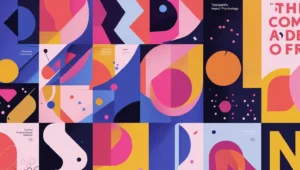
Every piece of design we interact with begins with something invisible but powerful: typography. Whether you’re reading a billboard, surfing on the internet, or glancing at packaging on the supermarket store shelf, type is speaking before words are even completed. Typography in design is all about the look of text; it’s at the heart of how individuals receive communication. Properly designed fonts guide individuals, change mood, and shape opinion in silence.
Type is utility made beautiful. It can whisper subtlety or scream thrall. Bold font selection makes you more readable, enhances your brand recognition, and has a visual impact on your audience. In this article, we are going to discuss how type evokes emotional responses, influences creative success, and maintains the psychology of design. We’ll learn how a simple font can be turned into a valuable resource, communicating intricate concepts and establishing a strong bond with your people.
The Unconscious Psychology of Font Choice
How Fonts Influence Emotional Response
Consider opening a wedding invitation in a significant, military-letter type. The letters, which define the celebratory event, would be serious. That’s a small example, yet it violates a more general rule: fonts are emotional, just as images are. A font’s lines, forms, and weights all have psychological associations and emotional meanings that influence how we interpret messages.
Serif fonts’ tiny beauty spots at the end of each stroke make them awkward, formal, and antiquated. They represent tradition and durability and may be found in court documents and outdated publications. Without them, sans-serif typefaces feel more modern and minimalist. They are IT culture and minimalism’s font of choice, so they have simplicity, efficiency, and openness to what is coming next.
The Personality of Typefaces as Individuals
Each font possesses a personality. Elegant handwritten lettering in a children’s book conveys a different message from a geometric boldface in a computer advertisement. Script lettering is nostalgic or graceful, but solid slab lettering conveys the message of solidity and confidence. These kinds of qualities are not accidents; they are built in with the designer’s intentional aim to pair a visual message with one that they would want to produce on an emotional level. To use a font strategically, get to know the “personality” of a font. It’s just balancing the visual personality with the mood of the message.
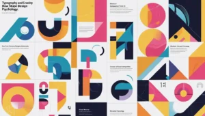
Typography as Artistic Expression
The Artistic Side of Font Design
Typography is functional, yet highly expressive. Beyond the more commercial choices, designers would then necessarily play with handwritten or manipulated fonts to create unique visual narratives. Fonts could be computer-cut, hand-drawn, and skillfully mixed and recreated to convey a mood or even, quite possibly, an identity. It is here that branding and art intersect: a type becomes a sign that conveys a message and evokes a sensation even before words are being read. Imagine the famous faces of a cult movie title or old company logo; that personalized lettering is part of its iconography.
Current Trends in Modern Typographic Design
Current design trends are moving towards minimalism, but with creativity. The market is abandoning flat fonts and choosing personality-based fonts without sacrificing legibility. Sizzling directions are
- Humanist fonts: They are warmer and more legible and have character and full legibility. They are ideal for businesses that would want to seem friendly and approachable.
- Geometric Fonts: Geometric fonts are just too cool for modernist, futuristic, or even architectural brands. They are a mark of sophistication and a modern visual look.
- Variable fonts: Advanced font technology that allows a single font file to hold tons of weights, widths, and styles. It is not just file-size-cost saving but also gives designers a level of creative control and flexibility for responsive design unparalleled before.
Typography no longer remains static. It changes, adjusts, and modifies itself with technology, offering unlimited scope for imagination.
Fonts to Read and Impress
Readability and Legibility: The Pillars of Effective Design
Creativity is necessary, but readability is essential. The best design will weigh the two against each other with finesse. Legibility is also the product of numerous factors: letter spacing, contrast, font size, and composition overall. Font misuse will result in a poor user experience, which will wear you out. Particularly with electronic media, where readers receive material on a variety of devices, from giant displays to mobile phones, designers must constantly put the user experience first at every stage.
Fonts That Perform Best in Practical Settings
Clear fonts are used and tested, as they are neutral, normative, and readable on a broad range of diverse screen resolutions and hardware. As typeface designers resort to well-tested conventions such as
- Robot: A crisp modern sans serif that is extremely versatile and legible.
- Open Sans: An open-source sans serif that is friendly and very legible.
- Georgia: A traditional serif face highly readable for screen, with a familiar and traditional look.
- Verdana: A font specifically designed to be displayed on-screen with large character shapes readable at small font sizes.
- Lato: A clean, corporate sans serif face that is sophisticated and very legible.
These fonts grab someone’s attention and reduce visual fatigue. A pleasant font on a computer monitor will appear crowded or out of focus on a cellular phone, making it a practical issue to test how your chosen font looks on mobile devices.
Typography and Brand Identities
How Fonts Represent Brand Values
Typography is the first thing users are going to observe on a web page or product label. A company that uses clean, regular typography is more esteemed in the long term. The choice of typeface by a company shows how professional, innovative, elegant, and reliable it is. Serifs are ideal for sectors like business and education, especially as AI in education continues to evolve, since they can represent tradition and history. Because it can connote warmth and welcomingness, a rounded sans serif is ideal for an idea or wellness brand. The font you use influences how your target market receives the language of your company.
The Voice Consistency of a Brand
Fonts also visually convey what a brand needs to communicate. Consistency of types across online advertisements, websites, emails, and parcels creates recognition and an emotional connection with customers. If a brand is typographically consistent, it appears credible and builds a strong, long-term brand image. Consistency does not mean the same font everywhere; it means a typography system involving an apparent hierarchy of order and purpose.
Typos to Avoid
Font Overload Avoidance
This is likely the most common mistake: using two or more fonts on a single page. It leads to visual confusion, mess, and unprofessionalism. Two or three font families are often enough and should be proportional to each other to have an effective hierarchy. A business-like look will use one font for titles and another for body text, with the standard size and spacing used for a business-like look.
Visual Hierarchy Neglect
Text must lead the eye naturally. Headings must be emphasized, subheadings help to maintain their flow, and body text must be readable and legible. Disrupting these principles results in a fragmented experience and compromises legibility. A well-organized page employs font size, weight, and face to direct the reader regarding what is most significant, enabling them to move around easily.
Conclusion
Typography is not a decoration. It is a foundation of communication. Our mood, attention span, and memory are all influenced by fonts. They are the echo of your words, leading the viewer’s eye and creating emotions. A good font makes your work improved, whether you’re designing for the web, a company, or a social campaign. Typography is usable by anyone, not designers alone. It is for anyone who wants to communicate easily and effectively with other people. You can create beautiful and helpful pictures by carefully selecting the fonts you work with.
FAQs
What makes typography important in modern design?
Typography controls the visual mood of communication and ensures readability across platforms, from digital to print.
How do fonts influence the meaning of a message?
Fonts influence emotion and establish tone before the material is read.
On digital media, which fonts are most easily readable?
Fonts easy to read on screens are the likes of Roboto, Open Sans, and Georgia.
What number of typefaces can be used in a design? Is it limited to a maximum?
Professional designs mostly employ two or three type families to balance and resemble one another.
Why is typography critical in branding?
Typography defines the personality of a brand and establishes recognition through selective and systematic stylistic selection.