
Have you ever questioned why certain designs catch your eye right away while others disappear into the background?
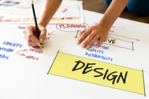
The skillful implementation of basic design principles is what makes it more than magic. A strong notion alone is not enough to stand out in our visually crowded environment. It demands a deep understanding of the language that shapes perception and drives connection. This guidebook is your guide to becoming the master of that language. We’re going on a tour of the 10 underlying design principles that empower every design professional with the ability to convert ideas into strong, irretrievable visual experiences.
1. Visual Hierarchy
Visual hierarchy is the intentional organization of elements to show their relative significance and skillfully guide the viewer’s eye. Visual hierarchy keeps your viewers engaged and has them devour what’s most important first, then slide effortlessly through the remainder of the content.
Without a visual hierarchy, your design can get easily muddled or cluttered and make it much harder for users to concentrate on your message and understand its value. Use these as visual hierarchy examples in action.
Most Important Methods:
- Size Dominance: Larger elements automatically draw attention. Your headlines, for instance, have to be clearly larger than your body text in order to provide instant emphasis.
- Color and Contrast: Leverage dramatic contrast to push calls to action or otherwise critical information into visual prominence out of the background.
- Strategic Placement: Center placement or top-level placement automatically grants precedence, leading the eye to the critical items first.
- Typographic Styles: Leverage bolding, italicizing, and font weight contrast to highlight various levels of importance in your copy.
2. White Space
Too often dismissed or misunderstood, negative space, or white space, is the intentional absence of content that surrounds and falls between design elements. Anything but empty space, it is an advanced design tool that works toward simplicity, elegance, and balance.
Why It Works:
White space in design actually makes space for your composition so that each and every element has room to breathe and truly shine as itself without visual overload.
How to Use It:
- Liberal Padding: Ample padding in between distinct elements creates an illusion of space and prevents the space from feeling congested.
- Generous Margins: Using generous margins along the borders of your design invites an open, inviting environment and avoids visual confinement.
- Text Readability: Padding bodies of text with generous white space smooths reading significantly and prevents mental overload, making the information much easier to consume.
3. Typography
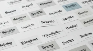
Typefaces are so much more than the selection of fonts; they’re the subtle science and art of designing how written text reads, sounds, and appears. It’s the tone of your design itself.
The Nuance:
Typographic traditions convey tone, personality, and professionalism. The smallest features, including character curves, line height, and kerning, may inspire a particular atmosphere and a nice visual rhythm. These are the typography basics.
Top Techniques:
- Brand Matching: To create a stunning visual narrative, carefully match type to your brand’s personality and message.
- Smart Pairing: For contrast and visual intrigue, carefully combine font types, such as a strong serif with an exquisite sans serif.
- Modify Spacing: To avoid overly heavy or light text and to make reading easy and beautiful, carefully consider line height and letter spacing.
4. Alignment
Alignment is the not-so-secret design principle where objects are aligned with each other, edges or centers meeting exactly to establish an unseen framework. It is the not-so-secret support framework of a polished design.
Why It Matters:
A mere minimal misalignment is all it will take for a sloppy or amateurish appearance. Alignment brings necessary cohesion, sense, and inner tidiness to your overall design.
Design Like a Pro:
Always apply consistent left, center, or justified alignment within a section. Align all text, icons, and images against a common visual axis. To be totally precise, use grids to make everything line up perfectly all over.
5. Proximity
Proximity is a design principle that like things go side by side. This subsequently makes it easier for the user to comprehend information as rational, manageable pieces and contribute towards instant understanding.
Visual Thinking:
Having things together close to each other means we inherently perceive them as a group, naturally enough since we spontaneously group ideas together when talking. It is most crucial to having fruitful proximity and alignment in layout.
How to Use:
Position headlines near their content. Employ strong separation between unrelated content blocks, obviously indicating a change of content. Cluster visual entities like text and icons with the same function to give emphasis to the relationship.
6. Contrast
Contrast is the intentional use of different size, color, form, or texture to draw attention to a point and visually engage the viewer. Dynamic energy that dispels boredom and draws attention to important information is contrast.
Why It Works:
Contrast immediately draws the eye, produces a dramatic visual effect, and communicates the most important elements of your design.
Design Tools:
Use bold color contrast for highlighted features. Scale type with clean variation in size for emphasis. Use combinations of font weights for contrast and hierarchy, such as a bold headline and a light paragraph type.
7. Repetition:
Repetition fortifies ideas by repeated repetition of something, such as colors, fonts, icons, or spacing within one piece of design or a whole system of brands. It’s the continuity throughout your visual story.
The Value:
Repetition gives a powerful sense of coherence, professionalism, and robust brand identity. It makes it easy for users to detect patterns and become familiar, which instills trust and usability.
Implementation Tips:
Apply the same type system and color palette to all your designs. Restyle certain graphic motifs like icons, shapes, or textures. Replicate it repeatedly over website pages, social media posts, and advertising campaigns for overall consistency.
8. Balance
Balance is a term used to describe how visual weight is distributed evenly across your composition. It is the principle that prevents your design from looking slanted or unbalanced, presenting an appearance of balance.
There are two types:
- Symmetrical balance: Traditional and formal with equal elements mirrored on both sides.
- Asymmetrical balance: Casual and dynamic, visual balance is achieved by the use of various-sized and contrasting elements.
Visual Harmony:
In symmetry, precisely mirror elements on a midline axis. In asymmetry, counterbalance large elements with small elements to achieve dynamic visual balance. Consider color weight and spatial relationship in your composition at all times to achieve overall harmony.
9. Color Theory
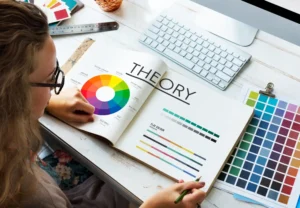
Color theory is the term for the way that colors relate to one another and how they impact human emotion and perception on a deep level. It is a nuanced but powerful language that beckons users to experience something even before content subconsciously gets imprinted.
Why It’s Irreplaceable:
There is a special story behind each color. Blue could represent trust and calm, whereas red represents urgency or passion. The right color palette can completely change the message and its emotional value.
Color Mastery Tips:
Choose a base color that really represents your tone or brand. Complementary and analogous color schemes help to create harmonies. Never forget the emotional and cultural implications your colors carry. Use color contrast with care to lead the eye and focus on main content.
10. Rule of Thirds
The Rule of Thirds is a respected rule of composition that divides a piece of design into three horizontal and three vertical zones and provides four most significant intersection points for focal interest areas.
How Designers Utilize It:
It prevents the two-dimensionality of middle-of-the-form designs, designing compositions that by necessity seem dynamic, purposeful, and attractive. It’s a device of image narrative.
Try This:
Visualize tic-tac-toe on your canvas as a grid. Place your key points, points of interest, on crosspoints or grid lines. On pictures or web page designs, place horizons or points of interest along these thirds for natural balance and beauty.
Conclusion
These 10 fundamental design principles do not involve obeying preset rules; they involve making a deeper awareness about how individuals perceive, feel, and react to pictures. Each of the ten principles offers you a powerful tool to guide emotion, enhance functionality, and achieve crystal-clear communication.
By consistently integrating these rules into every design project, your work will shift from being visually beautiful to strategically powerful. You will speak powerfully, lead boldly, and create visual journeys that connect and convert genuinely. Design is not decor; design is intentional storytelling. As you construct the future of your creative enterprise, claim these guidelines as your constant basis.
FAQs
What is the top design principle for a newcomer?
Visual hierarchy. It ensures users can easily read and find their way through your design without becoming lost.
How do design principles improve user experience?
They create intuitive, straightforward compositions that save mental effort and enable humans to engage with content more readily.
Is it ever possible to deviate from design principles?
Yes, but only once you understand them well enough to intentionally violate them for artistic or conceptual reasons.
Are these principles universal for all design forms?
Yes. From graphic design to UI/UX, print, and branding, these principles work across the board.
Do design principles become outdated with trends?
The fundamental ideas remain the same, but how they are applied varies to accommodate new platforms, styles, and technologies.