Colour is a force which directly affects the soul.’ Those are the evocative words of artist Wassily Kandinsky nicely summarizing the force of color. It is not an optic decision; it’s a one-to-one connection to our emotions, affecting the way we look at the world and, more literally in commercial terms, the way we engage with products and brands. We fail to exercise its strength, but a look at the facts is a reminder of its true impact.
It is proven through research that customers make early decisions regarding products within 90 seconds of viewing, and a staggering 62% to 90% of this decision is based on color. It is the foundation of emotional design, a scientific approach that consciously utilizes the power of color to create compelling user experiences. Here, we’re going to tell you how you can be a master of this simple element of visual design principles so that you can create a brand that speaks to your people.
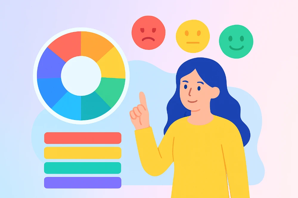
The Language of Color
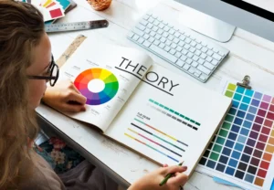
Effective color psychology in design is more than selecting a beautiful shade. It’s about knowing the profound psychological and cultural connotations that colors have. That is what allows you to speak nonverbally.
A Contemporary View of Primary Colors

Red, yellow, and blue, the traditional primary colors, are the foundation of any color palette. Red is a high-energy, stimulating color in the U.S. marketplace that can also be employed to carry a message of urgency. Red is usually reserved for calls to action or generating excitement, as with Coca-Cola’s brand name. Blue is also the favorite color and most closely linked with trust, security, and tranquility. To this end, it is among the choices for financial and medical corporations attempting to establish trust. Yellow is warm, cheerful, and bold. When used in moderation, it will give a sense of welcoming warmth.
The Nuance of Secondary Hues
Secondary colors provide a more complex emotional depth by combining the characteristics of their primary parent. Green possesses a strong connotation of nature, development, and health and is used by green brands or well-being businesses. It can even represent success. Orange combines the vibration of red with the energetic aspect of yellow to render it an active but welcoming color. Purple has traditionally been the rich, high-end, and sophisticated color and is employed by those firms that wish to express premium quality.
Associating Color with Emotional Design Principles
Color is what gives emotional design life at various points of user touch. A well-established color strategy can lead a user along a path and create an enduring bond.
Visceral Design
This is the first, gut-level reaction a user has to your site or product. The color palette is the first thing they encounter, and it determines the tone for their whole experience. A bold color palette immediately conveys a playful, youthful brand, and a subdued palette might suggest a professional or serious one. That initial reaction shapes the foundation of their emotional path through your design.
Behavioral Design
Besides initial impressions, color also remains extremely influential when it comes to shaping user behavior. By using contrast color in calls to action, you can build a solid visual hierarchy and guide the focus of the user towards the essential elements. Strategic uses of color and emotion can affect conversion rates in spectacular fashion. For instance, a HubSpot study found that a red call-to-action button was 21% better than a green one, even in locations where there are popular connotations of green with “go.”
Reflective Design
This is where an effective color scheme builds long-term rapport with your clients. When the client looks at your brand colors, they should feel immediately relaxed and safe. This is the secret to building a brand. Brands like Tiffany & Co. might make one color an international symbol of luxury and prestige, creating a favorable reflective and emotional connection with the buyer.
Practical Application: Creating a Purposive Palette
Creating a strong color strategy is research-intensive and deliberate. This process is not based on personal taste but on a thorough understanding of your audience and the brand’s underlying message.
Intentional Color Choice

- Build Your Brand’s Emotional Story: What feeling do you wish to instill? Do you need to build trust and stability (blue) or urgency and momentum (orange)?
- Build a Replicable Color Scheme: Start with a primary color for your brand and then work from that to create a secondary and accent scheme that will play nicely along.
- Make Accessibility a Priority: Use your color choice to be sufficient to create contrast for readability, serving users who are color vision impaired. An accessible design is a successful design.
Color in Action: Case Studies
Consider the impact of Snapchat’s bright yellow, such a bright, sunny color, so perfectly reflecting its ephemeral, carefree content. Or Apple’s elegant black and white, which conveys elegance and understated sophistication. These companies use color to convey meaning and create an emotional connection, and for them a neutral color becomes the foundation of identity.
Working with Contemporary Color Trends
Design is not a fixed discipline. Emerging color trends yield new ways to connect with your client. Calming, natural tones are on the upswing as a way to convey peace, integrity, and greenness. This is a subtle but powerful way to connect with values of the time. At the same time, the opposing trend of bright, bold, highly colored shades is adopted by firms that want to be heard and convey the message of innovation and brightness.
Conclusion
Color is far more than a decorative element; it is a powerful strategic tool. By understanding and applying color theory and practicing it purposefully, brands can develop experiences that communicate on a fundamental, emotional level. From that initial, critical impression to the ultimate long-term emotional bond with a brand, purposeful color choices are critical. In an era where differentiation is most important, emotional design with color is a marketing resource that no company can possibly live without.
FAQs
What is emotional design in simple words?
It is product and experience design that evokes a specific emotion, such as happiness or confidence, to build a deeper connection and a longer journey with the user.
How do I select a good color scheme for my brand?
Start with your ideal customer’s brand emotions and feelings and select colors that are psychologically and culturally appropriate to these objectives.
Are colors the same color everywhere?
Yes, symbolism of color is highly variable; white is purity in Western cultures but mourning in some Eastern cultures.
Is there any color that will always elicit a particular emotion?
No, the meaning of a color is very dependent on the context, shade, background colors, and also the observer’s own cultural reference point.
How crucial is color in making a brand successful?
Extremely important. Color can make a brand 80% more familiar, and therefore it’s an important asset to possess for creating a recognizable and remembered brand.